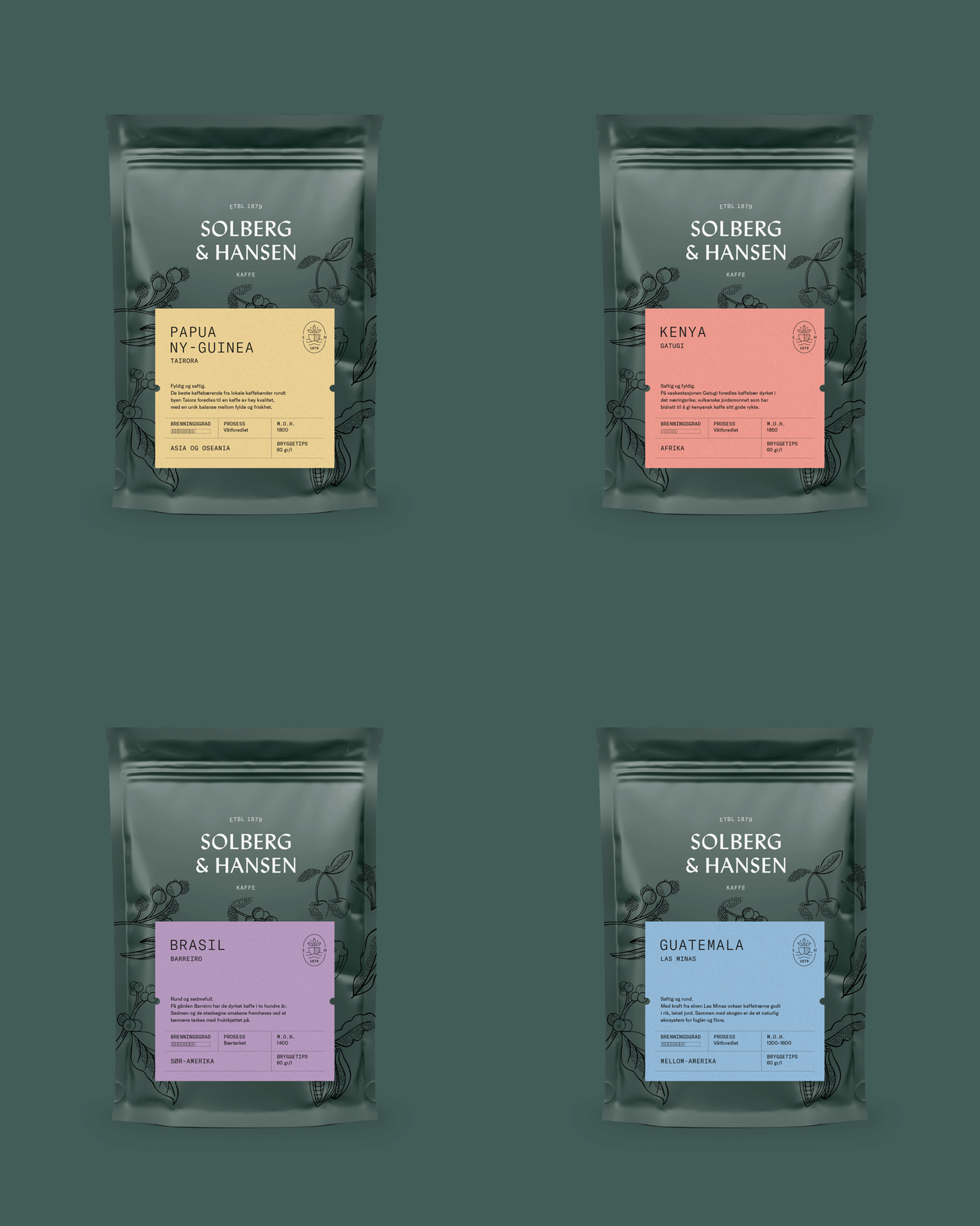
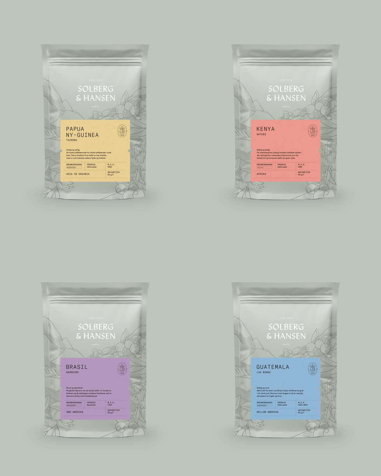
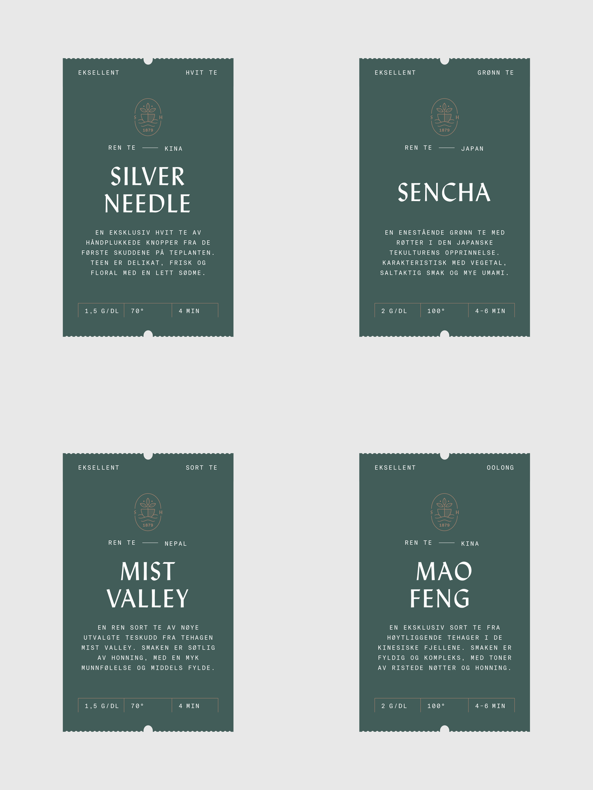
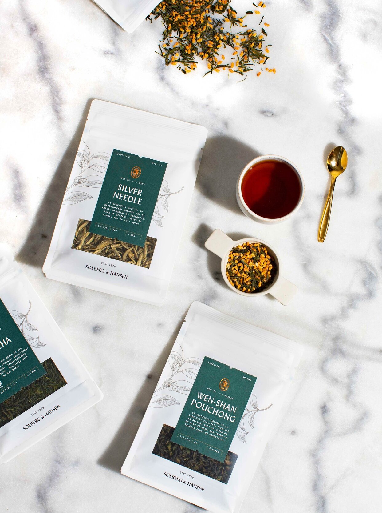
Solberg & Hansen has been a master within the coffee and tea industry for 120 years. Our goal was to make sure that the new visual identity and packaging design reflected this, and resulted in the concept “The establishment”. The packaging design had to communicate Solberg & Hansen’s knowledge, quality and excellent taste. It was essential to clarify the diversity in coffee types and design a system of labels securing a clear hierarchy and navigation between variations.
The entire product portfolio has been restructured and recategorized. Color and decorative elements separate the categories, whilst logo, text and branding elements are uniform across the range. The five categories of coffee are: Espresso (Black), Fairtrade (Light green), Flavors of the continents (dark green), Blends (white) and Seasonal/Campaign (white with illustration). In addition, the labels were split into three levels of quality: Classic, Exclusive and Micro Lot. Every continent has its own color.
For tea, we differentiate between pure and flavored tea. The pure teas are white and monolithic, while the flavored teas have colors based on their ingredients.
Client –– Solberg & Hansen
Project –– Visual identity, Packaging


